Goshuin-Go!
Project
Helping tourists in Japan find and collect unique souvenirs
Timeline
2019 – Initial design
2020 – MVP using Bravo (WIP)
Summary
Goshuin are unique and personal souvenirs, but many things prevent tourists from collecting them. My solution helps them find the information they need and keep track of their collection. In turn, the tourists financially support the traditional shrines and temples that sell these Goshuin. Helping to preserve their history and traditions I create a win-win situation.
Responsibilities
- Research
- Prototyping
- Visual Design
- Interaction design
- User testing
How this project started
A few years back me and my girlfriend visited Japan. She had bought this special notebook at a department store, and every time we visited a temple or shrine she would collect a stamp. These stamps (Goshuin) and the books you keep them in (the Goshuinchō) are part of an old tradition. Collecting them during your trip through Japan is like partaking in a pilgramage. After returning home you have a book filled with memories you keep forever. But where to start? My exploratory research showed there was little to no information for tourist to learn about these souvenirs.
Research
Competitive analysis
Except for some basic information on Google and 2 books on Amazon (out of stock) there was little to find on the subject. With no direct competition I focused my competitive analysis on travelling-apps and the features they offered.
User research
Starting with a lean survey canvas I narrowed down what I wanted to know. Using my network and browsing social media I contacted people who either travelled to Japan or wanted to go there at some point.
Results
I used an affinity diagram to organise my data. Some interesting things caught my eye, but the conclusion was simple: Goshuin are becoming increasingly more popular, but finding information is hard.
Furthermore:
- 75% of people collect alone
- Google Trends showed searches for ‘Goshuin’ have been increasing since 2017
- 70.6% did no prior research, but of the remaining 29.4% more than half looked on Google and somewhat less than half asked friends and family
- People rated finding info online with an average of 2.5 out of 5

Feature comparison

Business comparison
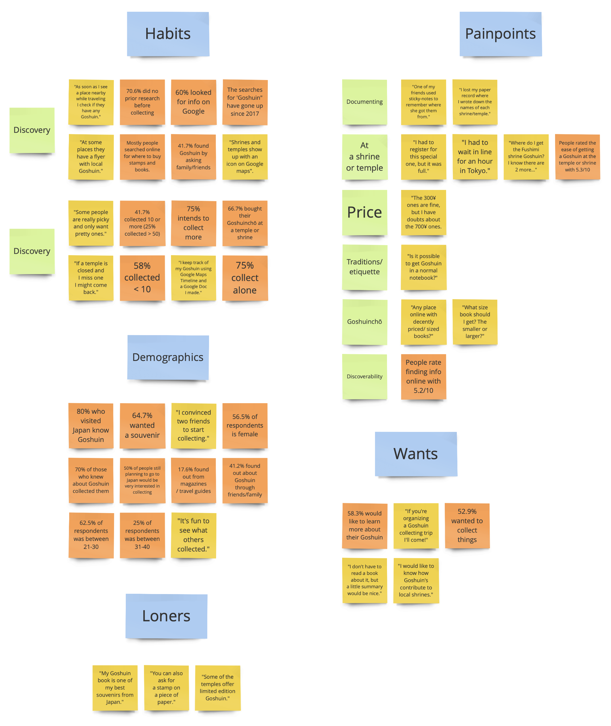
Affinity diagram: Click image to enlarge
Defining the scope
Personas
I wanted to reduce assumptions, so I stuck as closely as possible to the data to create persona’s I could substantiate. This resulted in two, very text-heavy, persona’s called Rose and Floran.
- Rose is new to collecting. She struggles most with finding out where to buy the Goshuin and how to plan which places to visit so she can collect as many as she can. She also lost her notes on where she collected each. She likes to learn more about the Goshuin she collected and will definitely collect more!
- Floran is a little more experienced and has collected over 80. He searches out the more unknown shrines/temples but sometimes misses out on limited or seasonal Goshuin. He wants to financially support the places he visits and shares his collections on social media.
User journey map
Rose is planning her first trip to Japan. What would this experience look like? I created an extensive user journey based on my research. It shows her experiences, the problems and opportunities.
Problem statement
My research confirmed that “Tourists who visit Japan do not know where to collect Goshuin”. But there were more problems:
- They arrive at the wrong time
- They can’t find the Goshuin office
- They can’t keep track of what they collect
All of this gave me enough to narrow down the scope of my project.

Personas
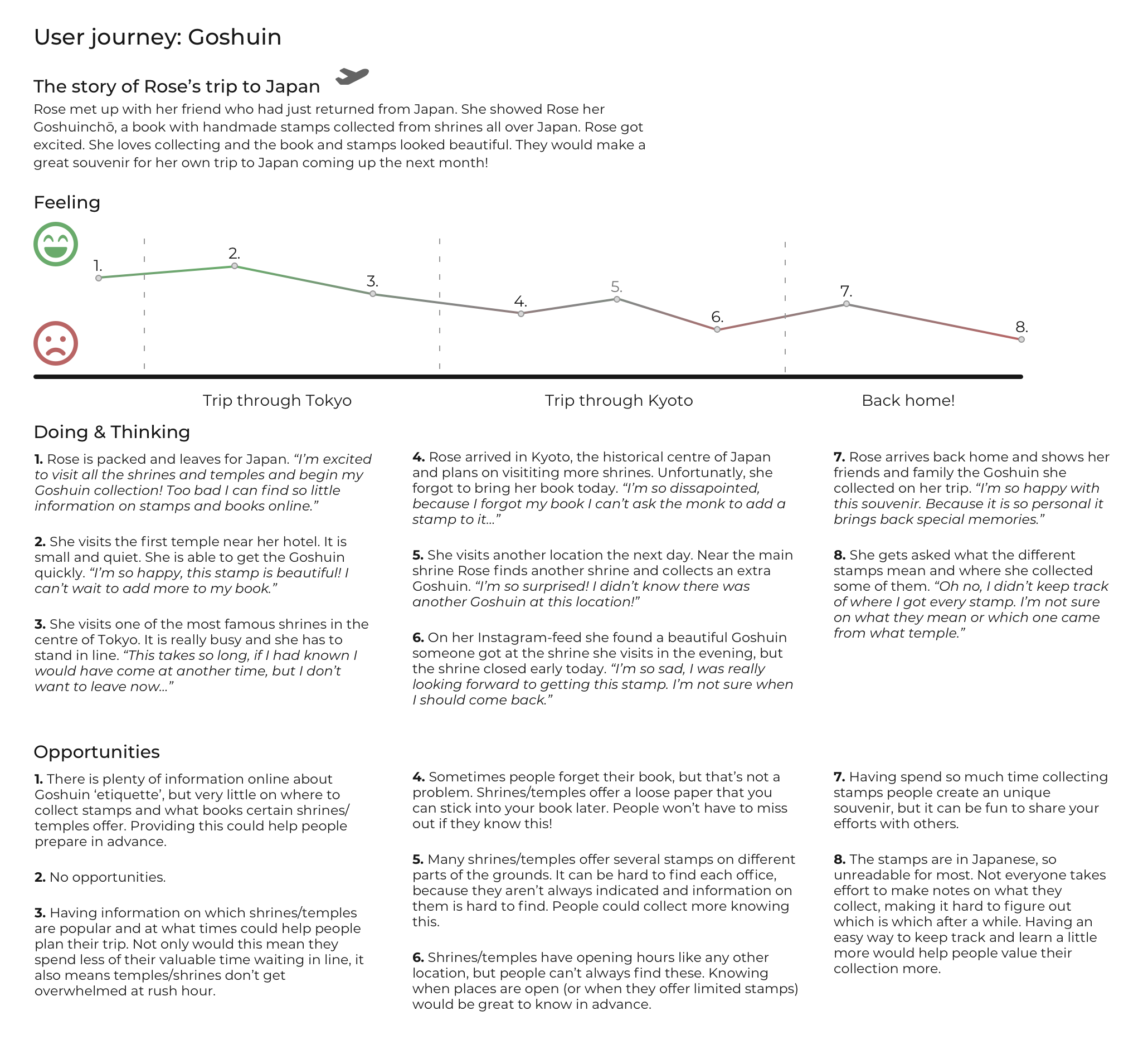
User Journey: Click image to enlarge
Ideation
Mindmap
When working through a project at a quick pace it is easy to miss some things along the way. Before starting ideation I created a mindmap with everything I learned so far. Together with my persona and problem statement I started brainstorming ideas.
MoSCoW
The ideation process gave me many great ideas. So many I had to prioritise using MoSCoW. Regardless of priority they could be separated into two categories:
- Features related to finding the temples/shrines, learning about their opening hours, the stamps they offer and their prices. (These relate directly to the problem statement).
- Features related to the community aspects of sharing your collection, uploading your own images, and seeing what others have done. (These relate to empowering the community to generate content).
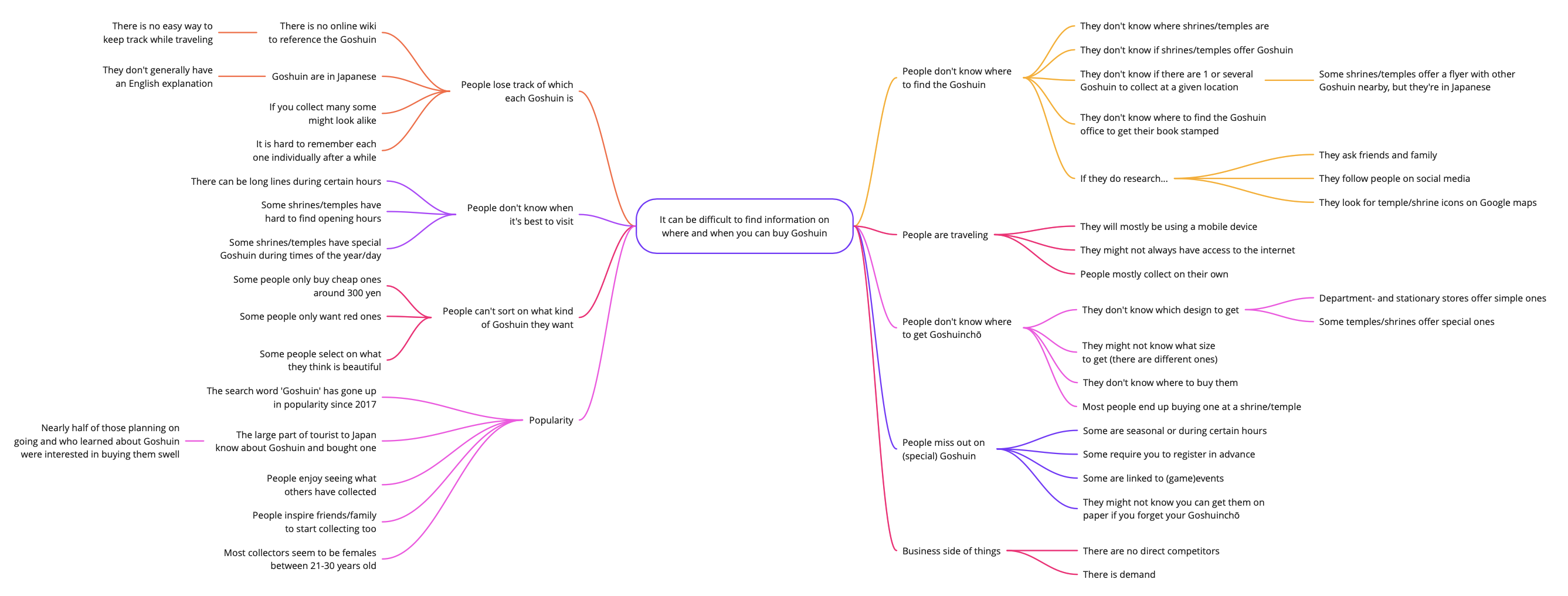
Mindmap: Click image to enlarge
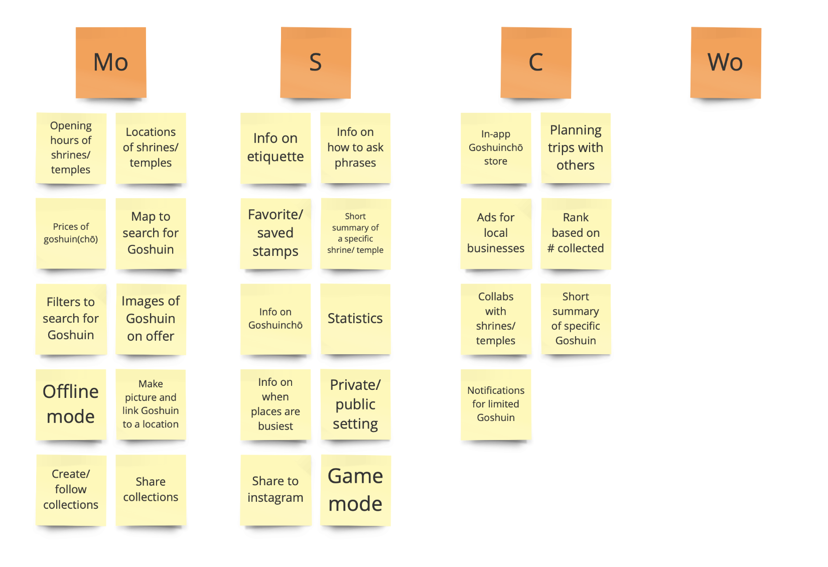
MoSCoW: Click image to enlarge
Information Architecture
App-map
Goshuin collectors do little research beforehand and they don’t carry large devices when going on holiday. So an application was the logical way to go.
I grouped the essential features into related pages and created menu items to build up the app’s structure.
User flow
I wanted to validate my new user journey so I created a user flow. This also made it easier to quickly test and iterate on missed pain-points. For example, my first user flow was to simple and didn’t consider enough ‘alternate routes’. The final result gave me enough to start work on my paper prototype.
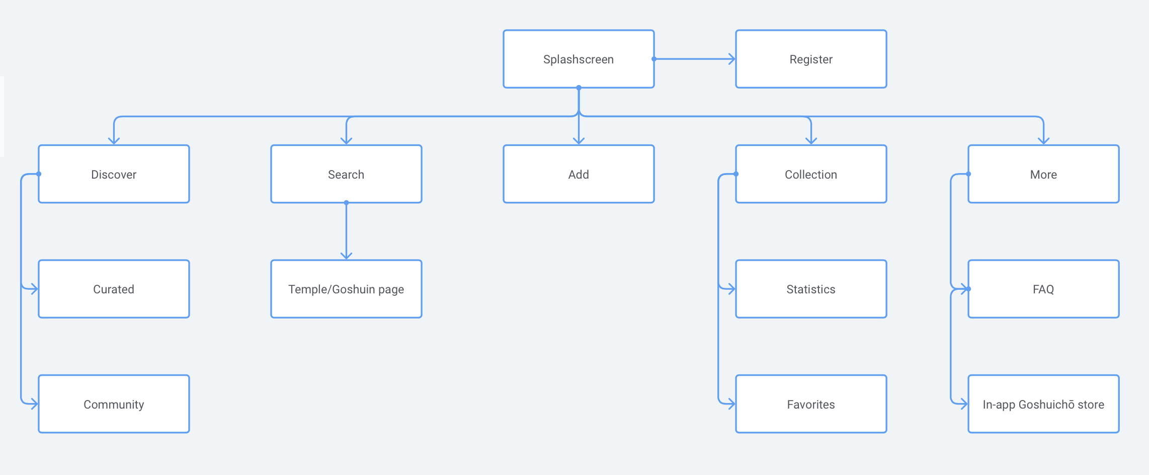
App-map: Click image to enlarge
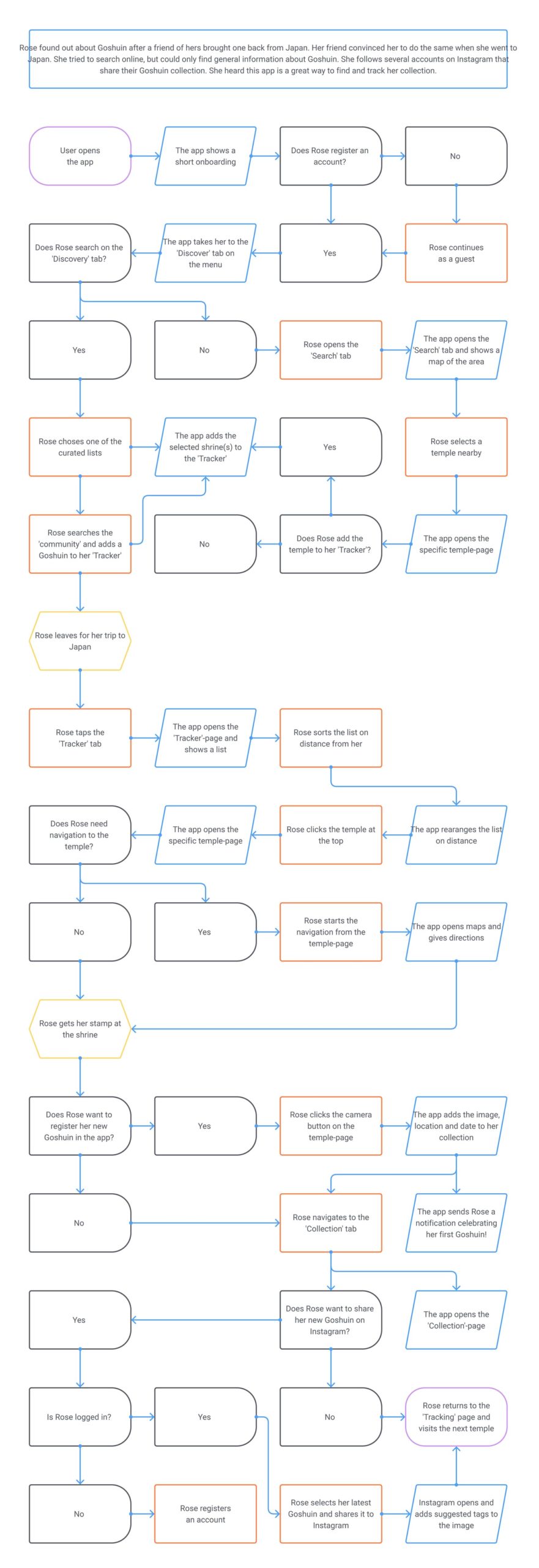
User flow: Click image to enlarge
Mid-way Pivot
User testing
With the help of my paper prototype I gathered feedback from several users. This helped me fix smaller issues, but it showed two large flaws.
- My prototype had to many features. That is why I decided to cut some of these out of the hi-fi prototype so I would make the deadline with an MVP.
-
The community features were shaky and based on too many assumptions. However, I had added these out of necessity to create the content for the app.
Research – revisited
In search of a solution I dived deeper into the forums and came across a site (in Japanese) by a blogger that had recorded over 13.000 different Goshuin all across Japan! This solved my content creation issue. I was able to scrap a number of community features and focus on the core functionalities that would address the problem statement.
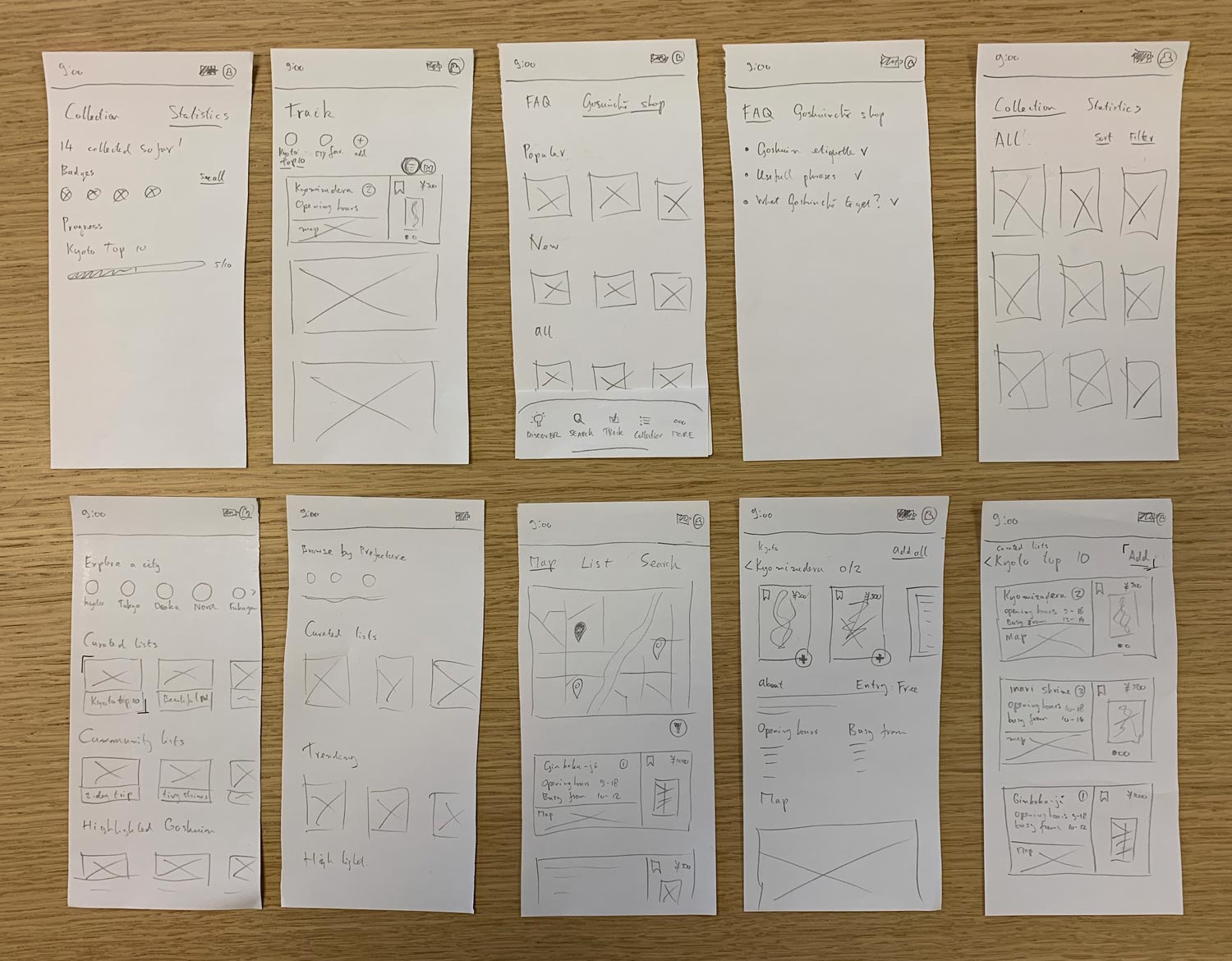
Paper prototype: Click image to enlarge
UI research
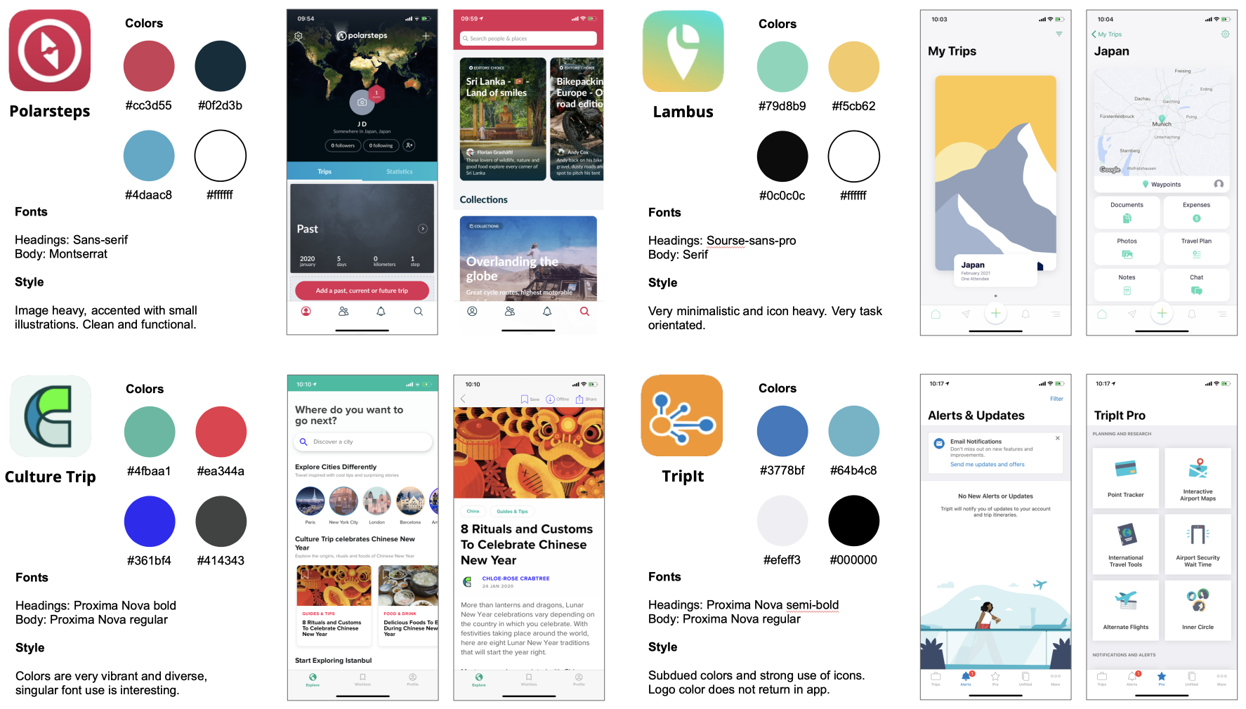
Visual identity competitive analysis
I compared the same apps I used for my feature and business analysis. I looked at colours, fonts and general style to get a feel for what was out there. Polarsteps and Culture Trip were especially insightful, because those apps were similarly content heavy.
Moodboard
Next I created a moodboard. I wanted a clean design with little distractions. I decided to go for red with my primary color. This specific color has had many influences in Japanese culture (such as the language, cuisine and fashion). It is also a color associated with many different shrines and temples, and especially Torii. The red color of the shrine gates symbolizes vitality and protection against evil.
Visual competitive analysis: Click image to enlarge

Moodboard: Click image to enlarge
Design System
Typography
The fonts were a little harder. For the display font I went through about 400+ different brushes. I was looking for something that captured the feeling of the Goshuin, but it had to be readable. Many of the brushes were ’too much’, too thin, too broad, etc. In the end I user tested 5 different brushes. Sanstuy Brush anonymously came out on top. As for the heading and body font I chose Hiragino sans. This font actually seemed to be designed for Japanese characters, but that gave it the exact ‘Japanese’ feel I was looking for.
Colors
Red was my primary color for its significance. A simple grey scale was going to be my support color and of course I added in a white.
Sketch symbols
To make things a little quicker and easier, while working on my UI, I created a set of symbols. The ones shown below are the final versions. Some of them went through several iterations, especially the Temple/Shrine-card on the second row.
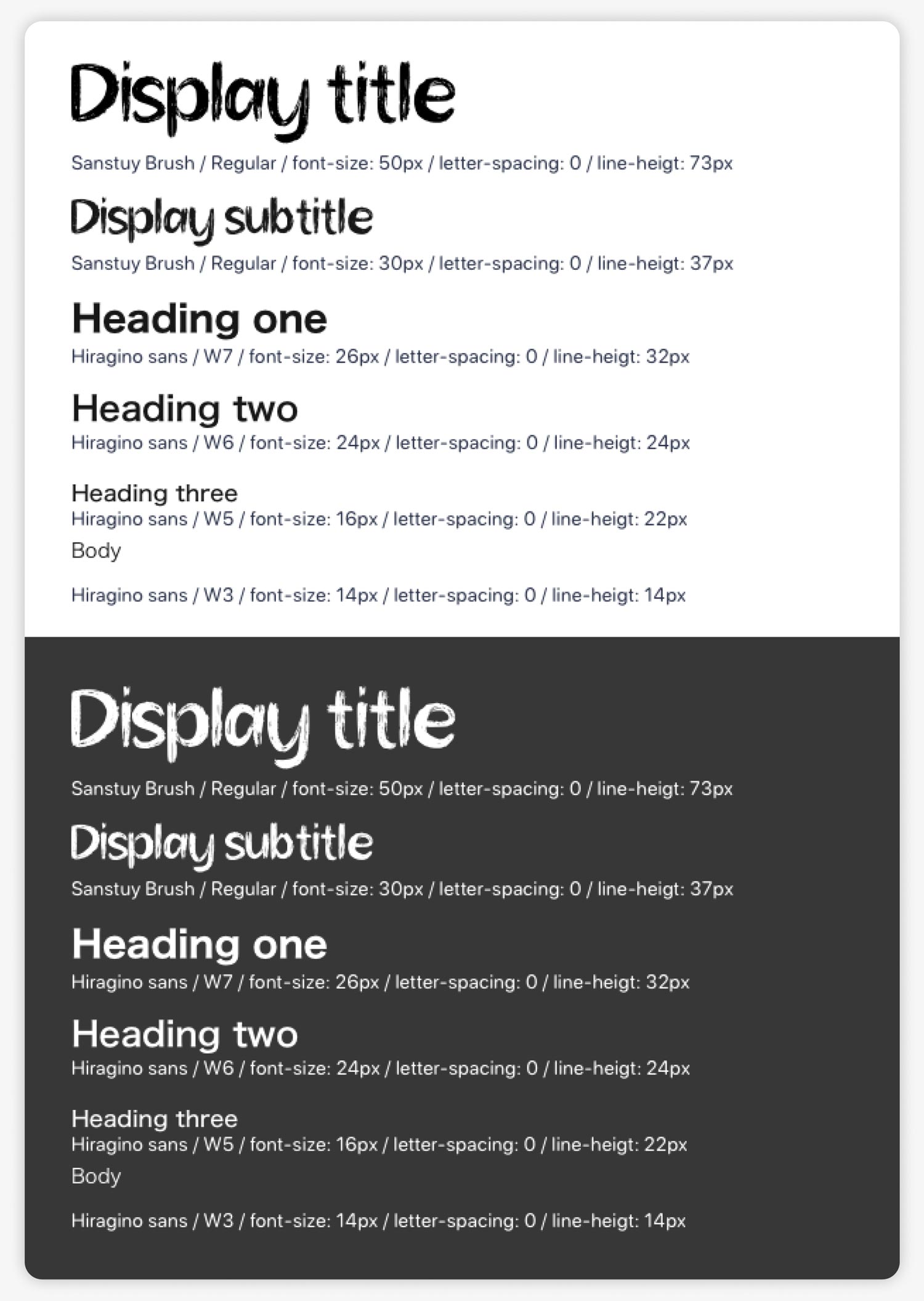
Typography: Click image to enlarge
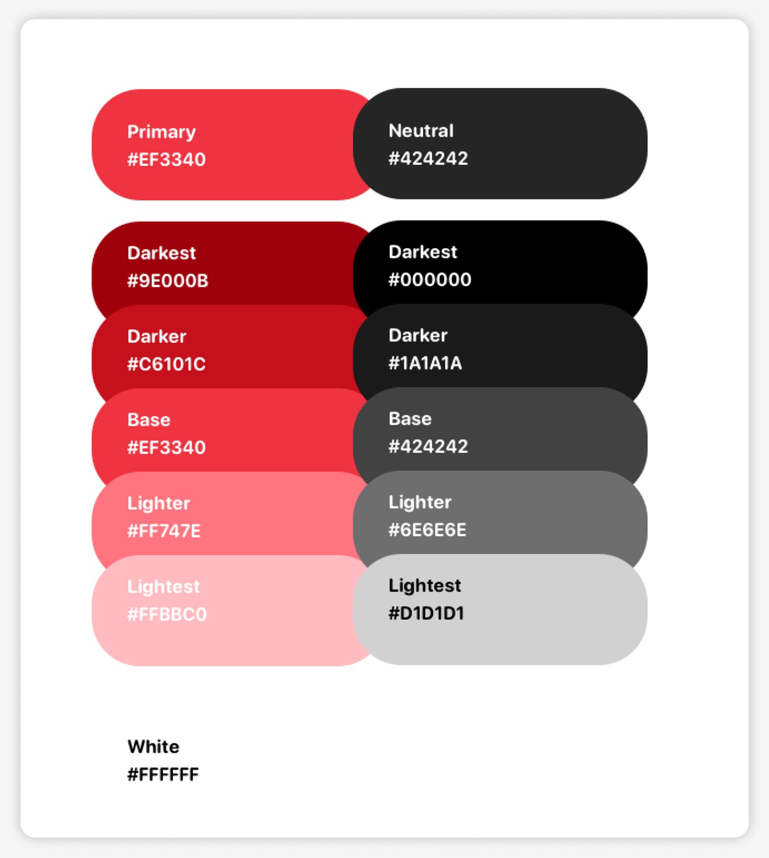
Colors: Click image to enlarge
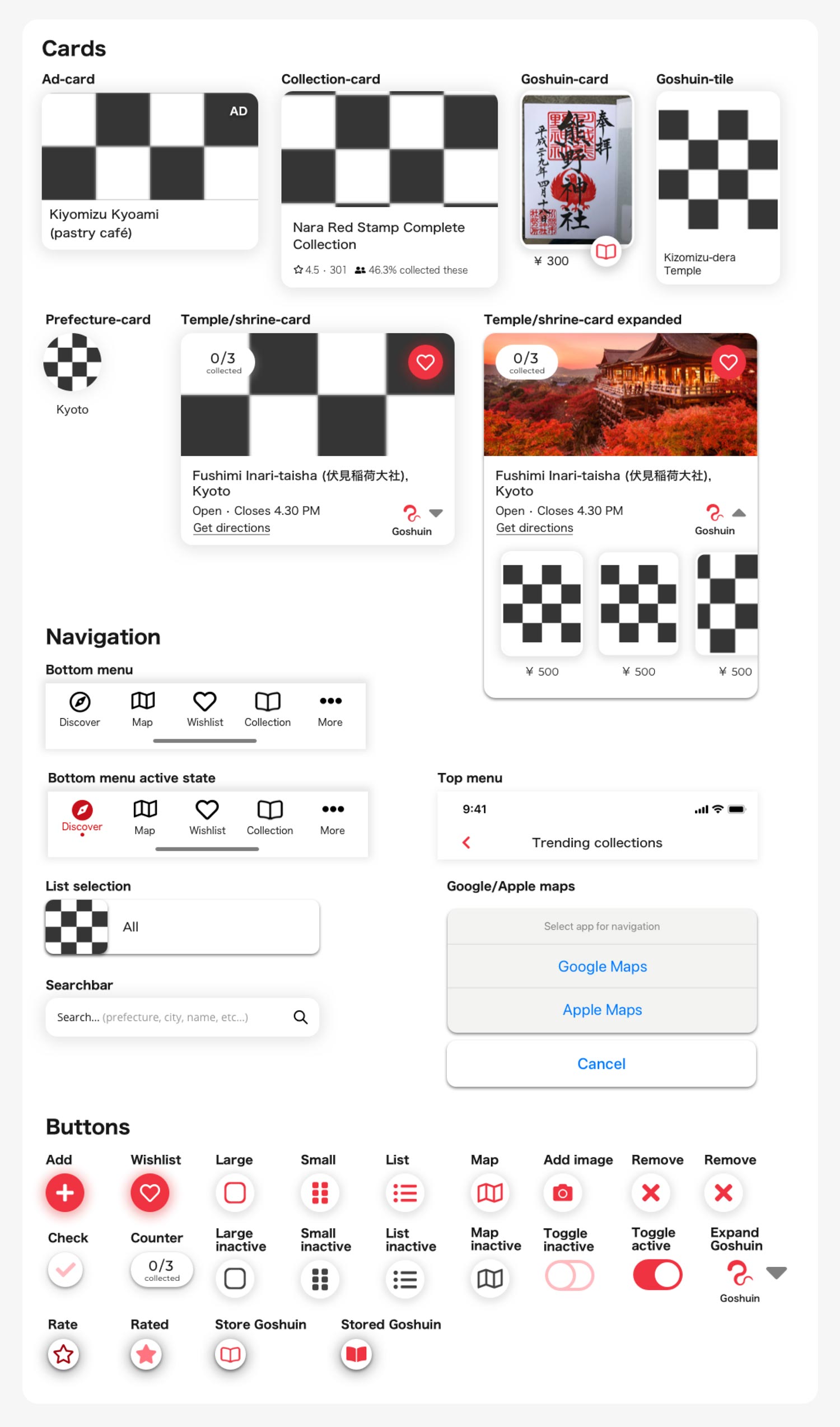
Sketch symbols: Click image to enlarge
UI iterations and additions
Temple/shrine card
This was one of the most important elements of my design. This overview card needed to provide the most relevant information and related actions. Doing this right would save the user time and make the abundance of information easier to navigate. Unsurprising it underwent a lot of testing and iterations.
The thing I struggled with the most was figuring out what information and options to show on the overview, and what to show on the detail page.
Considerations such as responsiveness (different screen sizes or text-boxes) and usability (number of features, affordances, etc.) helped me refine the UI.
Red was my primary color for its significance. A simple grey scale was going to be my support color and of course I added in a white.

Browsing by map
User testing showed this was a missing and important feature. In case a user couldn’t remember what a Goshuin looked like, but remembered where it was from, the map helped find it. The map allows users to pan and zoom after which the list of Goshuin, shown below, automatically adjust to those corresponding with the area on the map.
Final design
Landing page and app-store
After finishing the hi-fi prototype there were a few small challenges I wanted to set myself. This is why I created a desktop landing page, a iOS app-store listing and a dark-mode. Logo design for the splash screen was made by Violet Jim (thank you!).
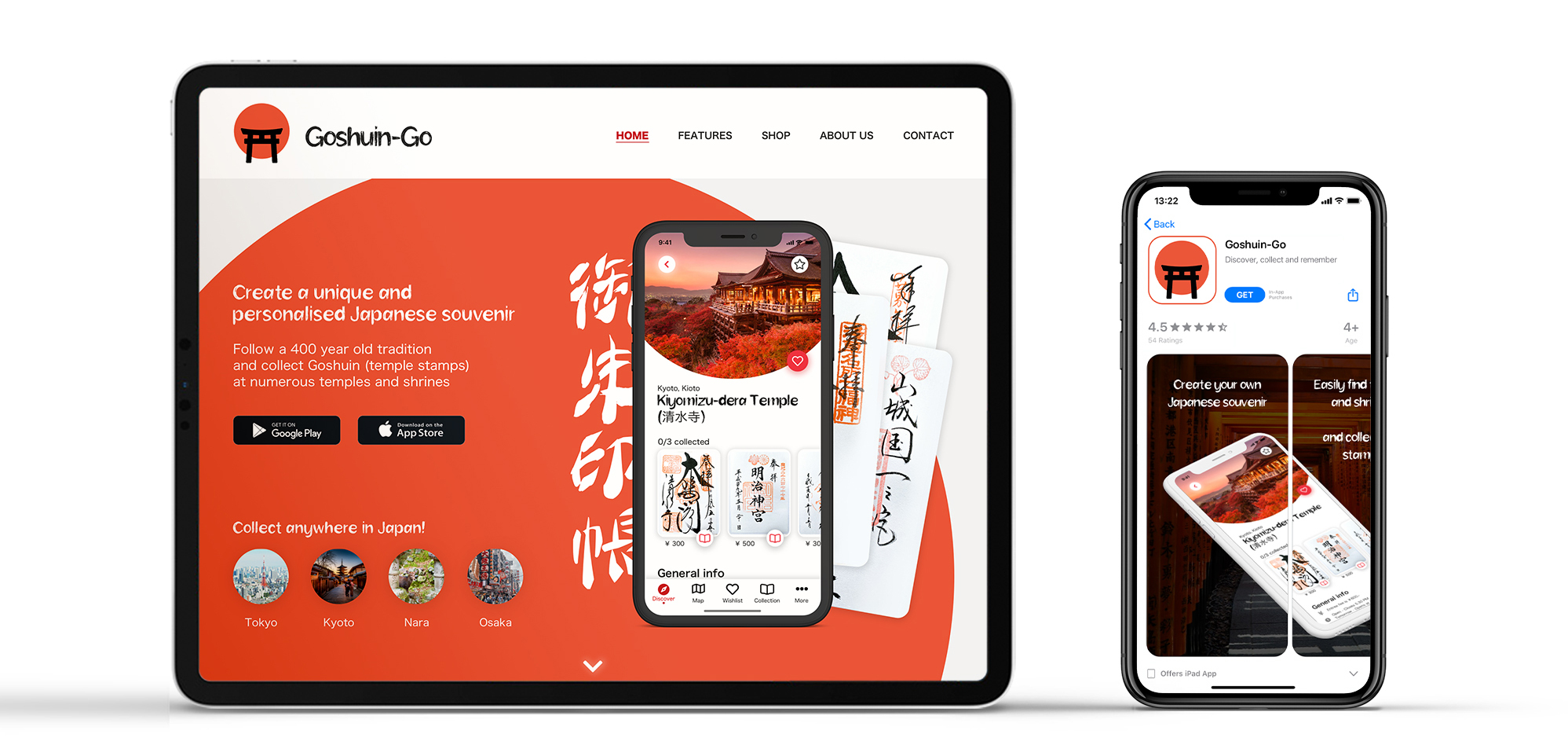
Landing page & App store: Click image to enlarge
Static screens

Full prototype (Sketch, video)
Interactions (Invision Studio, video)
Conclusion
Summary
Tourists in Japan who want to collect Goshuin need the right information on where and when to buy them, because any available information is in Japanese and unstructured. This forces them to take their chances and results in them often missing out.
Through my research I found the most important pain-points and worked on ideas to solve these. Using the groundwork it laid I gave shape and created a hi-fi prototype for an MVP. With a content heavy interface I made sure the design was clean, so I tested and iterated the UI until it fulfilled my aesthetic and functional requirements.

Personal take-aways
- UX: Looking back it is really interesting to see how the end product compares to the first concept. Having a personal interest in the topic helped, but I made sure it didn’t cloud my judgement. Trusting my research and listening to user feedback I made necessary changes along the way. Especially testing my paper prototype and redoing some of the research helped me fix the largest weakness in my UX design.
- UI: Going into this project I knew it would be very UI heavy. This was exactly what I was going for as well! UI is not my strongest suit and I wanted to see how far I could go. Looking at the final result I am very happy with how it turned out.
Future ambitions
I would love to develop this idea further. Currently I am experimenting with Bravo to create a MVP that will launch on the iOS and Android app stores.
- One thing I am particularly interested in is a game mode. In the current MVP users can see exactly what Goshuin they can collect at each location. However, some people might enjoy the thrill of discovery. By enabling all the Goshuin images to be blurred the user would not see any ‘spoilers’. It would also be really fun to find the stands where the monks are working by having a compass on the Apple Watch. It would be like treasure hunting where the watch vibrates more strongly as you get closer to an undiscovered Goshuin!
- I would also like to dive deeper into research concerning the community aspect. I feel like there is potential, but further user research will have to show what kind.
- Finally I would want to hear what the temples and shrines think about the concept. How would the app be able to further benefit them?

Contact.
LETS GRAB SOME TEA
(OR COFFEE)
I am always down for a good conversation and new chances, so don’t hesitate to send me a message! A cup of tea or coffee never hurt anyone.
