Centerparcs
Simplifying the user-flow
• UX research: desk-research, interviews, customer journey mapping, user testing, card-sorting
• UI design: Lo-fi sketching, hi-fi UI design in Sketch and Invision
About Centerparcs
Centerparcs is a chain of holiday resorts (Netherlands, Belgium, Germany and France) that offers guests everything from holiday homes, to activities and restaurants. Their main focus is families with younger children who stay for a week(end). They also facilitate people who visit for a single day (including birthday parties and company outings).
Motivation for the redesign
Through a special offer I obtained tickets for the Aqua Mundo (a subtropic indoor pool). Together with my girlfriend I spend the day enjoying all the pools and slides. When I told my friend about it he wanted to do the same! However, he came back to me asking how I had gotten the tickets. Getting them had been so confusing he had given up.
Centerparcs has two websites and an application. This makes planning a stay, or booking an activity, very frustrating for their guests. I set out to simplify their customer journey by improving their site and the application. Considering the context above my main focus will be on day guests.

Deskresearch.
One target audience, 3 platforms
Centerparcs has 3 different platforms
- The main site centerparcs.nl allows guests to rent a holiday home or hotel
- On the secondary site dagjecenterparcs.nl day guests can buy tickets for the pool or make reservations at a restaurant
- The application allows guests staying at the park to book activities or look at a park map
My initial research shows that the same target audience is likely to use all three of these platforms. Some families that spend a week(end) on the park might come back later to celebrate a birthday party (as a day guest). I am assuming that the separating of these platforms is a system-centered design, instead of a user-centered design.
However, the biggest problem seems to be that the websites and application do not refer to each other. Furthermore, there is a lot of double information. Together this creates an inconsistent user customer journey map.

User research
Finding the pain-points
TLDR: After carefully reviewing the 3 platforms I conducted user tests with 5 participants. I also collected app-store reviews on the iOS app. These helped me create an image of the current customer journey map.
User Testing
I conducted 4 user tests with 5 participants. In each case I went through the same script. Using an iPad to record their on-screen actions and an iPhone to capture the audio I asked them do a series of tasks. I later combined these into single video’s to review and make notes. Overall the participants had a lot of trouble completing the main task of reserving tickets for the pool.

iOS reviews
The application scores only 2 out of 5 stars. As one person wrote: “It feels like an escape-room”. These negative reviews go back as far as a year, showing issues have been around for a while. The main problem seems to be logging in. The information also seems to be outdated and there are many other bugs. For some reviewers it even spoiled part of the holiday fun. This is a shame, because users see potential in the app. One person wrote: “There are so many potential additions to the app, like scanning your phone for access to the pool, ordering at a restaurant or letting them know you’re going to attend a free activity”.

User flow day guests
Below is a top-level user flow of the current situation. The lines indicate the way different platforms refer to each other. The red referrals negatively impact the user experience. The green referrals do support the user experience. It is plain to see there is a lot to do.

Customer journey map day guests
Looking at both the qualitative and quantitate data I can tell that, in the worst case scenario, day guests need to go multiple steps and actions to make a reservation. This leaves them frustrated, tired and even feeling stupid. Especially halfway through (if they need to call customer support) there is a big chance of day guests simply giving up and Centerparcs losing revenue.

Card sorting
I knew the current user flow was confusing, but before working towards a solution there was one more thing I wanted to know. The features were spread across three different platforms and two different types of devices. Listing all of these features, where would users expect (or prefer) to find them?
I wrote down all the features and created two categories (desktop and mobile). I then asked four participants to sort these features into one, or both, of these categories. There were several things that stood out:
- Users prefer to find information on the holiday homes, and book them, on a desktop version of a website
- Users prefer simple information such as a park map, opening hours and an overview of activities to be available on mobile devices
- Users want to be able to book most of the activities on both desktop and mobile, they also want to review their activities and make payments on both
Unsurprisingly this shows us that the features users expect on a device correspond to their location. Booking a holiday home is much easier on a desktop, because it allows for a better overview of all the information. On the park the user generally has access to a mobile device only. In those cases it is important that things such as booking a restaurant or checking opening hours is possible through this device. Finally, it seems important for users to have a sense of continuity where they can book activities or restaurants ahead of time through the website and change or view these later on their mobile device.

Ideation.
Combining user and business goals
TLDR: Simply easing the transition between platforms solves most of the pain-points users are experiencing, but digging deeper and redesigning the application combines user and business goals.
The easy way out
One way to solve the issue is by simply easing the user flow between the platforms. Centerparcs.nl (the main site) could feature a button that would redirect to dagjecenterparcs.nl (the secondary site). Then, on the secondary site, we could include a call to action for people to download the app. Finally, the app could feature a button redirecting day guests to the secondary website. This new flow (as pictured below) would remove the need calling the customer service and simplify the user flow.

Web design example
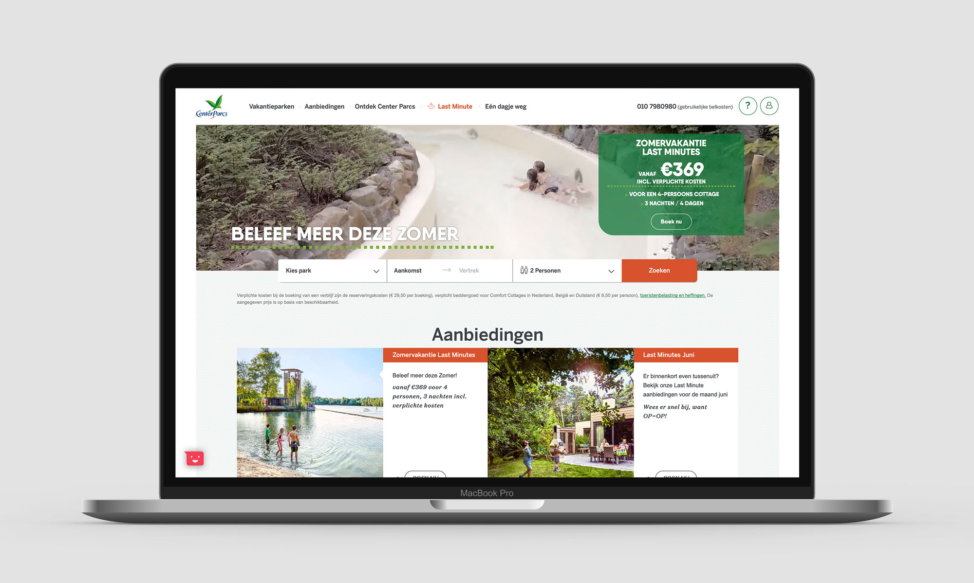
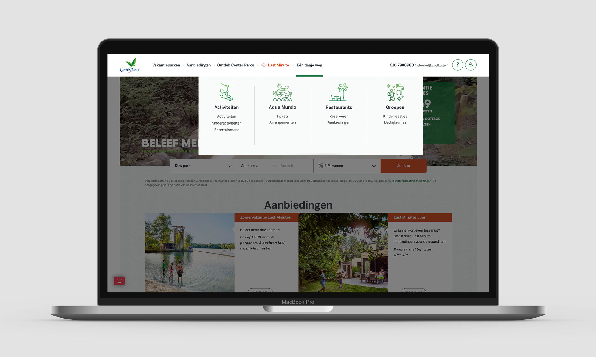
Below is an example of how the menu of the main site could be changed to add in features for day guests. The different parcs offer different activities and restaurants, but the offering is mostly similar. Thanks to this I could make four general categories (the pool, restaurants, activities and birthday parties/company outings). My assumption was that birthday parties and company outings make up an important part of the day guests, so that is why I made them a separate category.
This simple addition to the main menu of the main site would be the cheapest and easiest way to facilitate day guests and reduce frustration and loss of revenue as a result. All of the interviewees expected to see a button like this on the page. (Swipe the line across the image to inspect the new menu).
User and business goals
With the above examples we could mostly reduce user pain-points, but if we are looking to combine user and business goals we need a different kind of solution. Unfortunatly I have not had the chance to speak with higher-ups within Centerparcs. Instead I will try to put myself in their shoes and work from assumptions.
If I had to improve the current situation I would want the same as the guests. Activities that are quick and easy to book. This decreases customers walking away, reduce the workload of the customer service and provides better reviews and in turn a better reputation (participants mentioned they expected a certain level of quality from a big company like Centerparcs). However, as management I would also see the benefits of offering a more personalised offering to (day) guests. So to solve the pain-points I would turn to improving the application for 4 reasons:
- Currently the app is the weakest link
- A mobile device offers certain native features a desktop could not
- Guests generally carry only mobile devices when on the park
- And testers mentioned different features that could improve the application
Design challenge
Combining everything we’ve learned from user research and taking into consideration the probable business goals I have set out the following design challenge: “How can we improve the mobile application to make it accessible for day guests and give all of the guests at Centerparcs a more complete tool during their stay?”
Prototyping
And iterations
TLDR: I changed different parts of the current design. The navigation and the graphic design have been changed. Furthermore, making reservations has been made easier and additional functionalities have been added. I tested this design with four participants and made iterations along the way.
Lo-fi prototype
After going through the current designs I turned my ideas into a quick, lo-fi prototype made on paper. I tested this prototype with four participants and implemented their feedback into the hi-fi prototype. (If you would like to see the lo-fi prototype, click the image below).
Hi-fi prototype in Sketch
Below is an overview of the screens I made in Sketch. These include the feedback I received while testing the lo-fi prototype. Further down I have included some interactions and the rational behind them.

Iteration 1: Navigating through digital space
I paid attention to the types of transitions I used between screens to make it seem more ‘natural’ navigation through the app. For example: the list of parks came from above, like the shopping card. The profile, however came from below and this created some confusion.
After my iteration the digital space looks like pictured in the image below. The list of parks comes from below. The shopping card and the profile are group in the top left and come down from the top. Going deeper into the app, to make a reservation for example, users go right. Heading back towards the main menu they go left.

Iteration 2: Changes to the main menu
Based on user feedback I changed the order of menu items. Because of its different size the ‘restaurants’ button didn’t catch users attention as quickly. I grouped it together with the ‘activity’ button so that both reservation options are at the top (and most important).

Iteration 3: Making reservations
The new design features two kinds of reservations. The first are simple reservations such as the ‘Cool Factor’, where the user simply has to input how many will attend. The second type includes activities where the user needs to input more data, such as booking a day at the Aqua Mundo (pool). To make these reservations easier for users to go through I used staged disclosure. To keep track of their progress I provided numbers, but these were 1. too big, 2. and too vague for users to understand without a label.

Final design.
And explanation of design choices
My design challenge was: “How can we improve the mobile application to make it accessible for day guests and give all of the guests at Centerparcs a more complete tool during their stay?”
Final Hi-Fi design
In the final design making reservations has become easier for all (day) guests through an easier interface that supports payments. Furthermore, the application offers guests recommendations and promotes the additional sales of products/services. The new application makes the secondary site redundant and reduces the number of platforms from 3 to 2. Combined with the new user flow it reduces costs by decreasing the workload of customer support and maintenance costs of an additional platform. (Click on the image below the try the hi-fi app).
Choosing a park
The first thing the application asks to do is choose a park. User testing showed problems with the old design. Users had a hard time discovering the arrows to move left and right and none of them used the globe at the top. “I thought it would take me to the website and I would leave the app,” said one. In the new design the overview and options are bundled in a single screen, improving discoverability and making navigation easier. (A welcome screen is still included).

Making reservations becomes easier
The new design includes all information concerning the particular activity. Not having this information meant users had to navigate back to their overview in case they got distracted or wanted to double check before making a reservation.
The simpler activities also allow users to make the reservation straight from the information page without having to click through additional screens.
I noticed the application asked to login in many different places (if this had not yet been done). However, users reported that ‘having to login’ was one of the most frustrating parts of applications and sites. That is why, in my design, I chose the move the login further back into the customer journey. This meant users were only asked to login at the point it became necessary. At this point the user is more likely to be motivated and take the effort to login.

A tastier representation of the restaurants
To keep the application consistent I made the design of the ‘restaurant’ page similar to that of the ‘activities’. This reduces the learning curve for users. In this new design the user gets more information concerning the restaurants. This reduces their need to go back and forth between the overview and the individual restaurant pages. All together it helps the user quickly decide where they would like to eat and make a reservation.

A care-free stay thanks to reminders
Notifications are a great example of native options mobile devices have to offer. Imagine being a parent with a large group of kids running around. Having to keep track of their activities and making sure they aren’t late is much easier when parents are notified at the right time!

A better overview of reservations
In case users add multiple reservations to their ’temporary’ shopping card, they can individually select the activities they want to pay for. In some cases users are not sure they want to go through, but make the reservation in case they decide to go after all. The new design allows for flexibility and allows users to change or remove activities straight from the cart.
The renewed profile page offers a similar feature. All reservations are visible from the profile and users can change them when necessary. The menu at the buttom offers the options to contact customer service (decreasing the workload at individual receptions at parks). Futhermore, there are options to manage payment methods and change notification and privacy settings. Finally, it offers users recommendations for additional features and products.

Summary.
And follow-up ideas
Summary
Making a reservation was a frustrating process for (day)guests. The three platforms were badly connected which made the user flow overly complicated. After user testing I was able to find out what users expected from each platform. This way I decreased the number of platforms from three down to two. Not only does this reduce costs in several ways, it also increases the user experience (and revenue) while creating options to achieve several business goals.
Guests prefer to use the website when making a reservation for their stay or when they need to consume a larger amount of information. The application, on the other hand, offers options to view the services at the park during the stay. This new design creates a more consistent experience. It also adds native features, such as reminders.
Personal take-aways
I believe that working user-centered is a given. I feel like no company can build a long-term relationship with its customers if they do not have their best interest at heart. Combining user and business goals, however, is where I feel the real challenge lies. This project challenged me to look a little further than a ‘quick and easy fix’ and I feel that in the end I was able to create a solution that would add value to both parties. This was the first time I completed a thorough UX/UI process and I’m really happy with the results. *Edit: While working on this project I sometimes struggled with the lingo. I am now much more experienced in UX, but at the time I was less familiar with the lingo and tools.
Future ideas
Ideas for new features came from users and reviews of guests themselves. Ideas such as geotargeting certain ads (like a lunch-deal when near a restaurant), being able to order breakfast deliverd to the holiday home and more. These won’t only add to revenue, but decrease administrative and support costs. One of the users mentioned: “Standing in line to make a reservation for an activity is part of the Centerparcs experience”.
Centerparcs’ reaction to the redesign

Contact.
LETS GRAB SOME TEA (OR COFFEE)
I am always down for a good conversation and new chances, so don’t hesitate to send me a message! A cup of tea or coffee never hurt anyone.
